Simplifying Grade Input
I worked on a leading B2B SaaS platform designed to help after-school programs optimize student management. With powerful tools for tracking attendance, logging grades, and managing events. I worked with them to reimagine the way they were currently using their grade input feature
Role
Lead Product Designer
Time
3 Months
Team
Project Manager, Leadership , Development
Responsibilities
Strategy, Design, Customer Research
Problem
The Problem the organization was facing was a lack of user adoption due to the current interface not meeting their needs
Solution
After I spoke with different mentors I focused on addressing these problems specific in the user interface; information hierarchy, missing CTAS, and an inefficient process to send event invitations.
Research
How We Started
I started by having some internal meetings with the team I wanted to understand the importance of Grades for both the business and the users. I hoped this would allow me to get closer to a solution.
Grades are important for 3 reasons
Tracking grade can be summed up in 3 points Sales, Student success, and Funding.
Sales
Its a major selling point for our product many organizations that we service do programs outside of traditional schools and they need something to access performance
Student Success
It helps our users place students for college and adjust their mentoring based on the progress of the individual student
School Board Funding
Since a lot of our organizations are nonprofits being able to present this information allows them to secure more funding for programs
Research Goals
After learning more about the impact the grades feature had I decided to conduct some brief interviews with the current users. If i was devise a solution to customer adoption I would need to know what major factors grades tracking played in the day to day.
What data was most important for a school to place students? GPA's, Honors Courses, Weighted V. Unweightend? Standardized Tests?
What ways can we explore to reduce the workload for mentors by simplifying the process of input & tracking student grades, making it more efficient and manageable
Pain Points
Between the research done both internally and with some current users of the product I noticed to main user pain points
Finding Students in Need
There was no way to find and filter students who need help quickly and efficiently. This made it difficult for mentors to plan and give aid to multiple students.
Too many Students
There are simply too many students to for the amount of mentors to keep up with who is doing well and who isn't. Simply put the mentors need more help internally and externally.
Important Patterns Across School Programs
Along with pain points I picked up valuable information about the school systems themselves hat would help inform my designs.
GPA is King
Mentors highlighted GPA as the key metric for student success and college placement, emphasizing the need to account for both weighted and unweighted grades.
Quarters and Semester
Different organizations use different systems to break up the school year this changes the weight of a students grades.
Standardized Tests
Standardized tests, though crucial, vary by school and level. Beyond the SAT and ACT, tests like the EOG and NAEP must be considered, with some students taking them as early as freshman year.
Scales
Grade scales differ widely across schools and programs, with the same score (e.g., 81) translating to different letter grades.
Analyzing the Data & Strategizing
After gathering the data and seeing the patterns I started crafting a solution around how to redesign the UX & UI. I quickly realized there was no 1 size fits all solution for this problem
User Interface Strategy
Since a one-size-fits-all solution wasn’t feasible, I simplified the input structure by using various report card templates as a guide. This approach provided users with a more familiar and recognizable format.
User Experience Strategy
Taking in previous concerns about cognitive overload I wanted to create ways to guide our mentors and help them focus that specifically targeted students who might need help in certain classes
What I learned: We know what we know and don't know what we dont
Wrapping my head around all this new information about school systems and grading was difficult, but what I realized was I could spend many more hours trying to understand this. In order to drive this project I had to forgoe making a 1 size fits all solution for every organization and focus on the organizations where I could make a real impact.
Redesigning Grades
Skeumorphisim & Grades
When trying to figure out how to redesign we decided to go reference actual report cards
Skeumorphism
When I began the redesign for this I kept in mind what might be more familiar to the users. I thought about using actual report cards this would be easier for users to understand because it was something they were already used to seeing.
Before
Figure 1 Grades Input
Why Its Not Working
The initial MVP had a strong foundation but fell short in readability, progressive disclosure, and cognitive load. By making some simple tweaks to the layout and information hierarchy, we saw significant improvements.
After
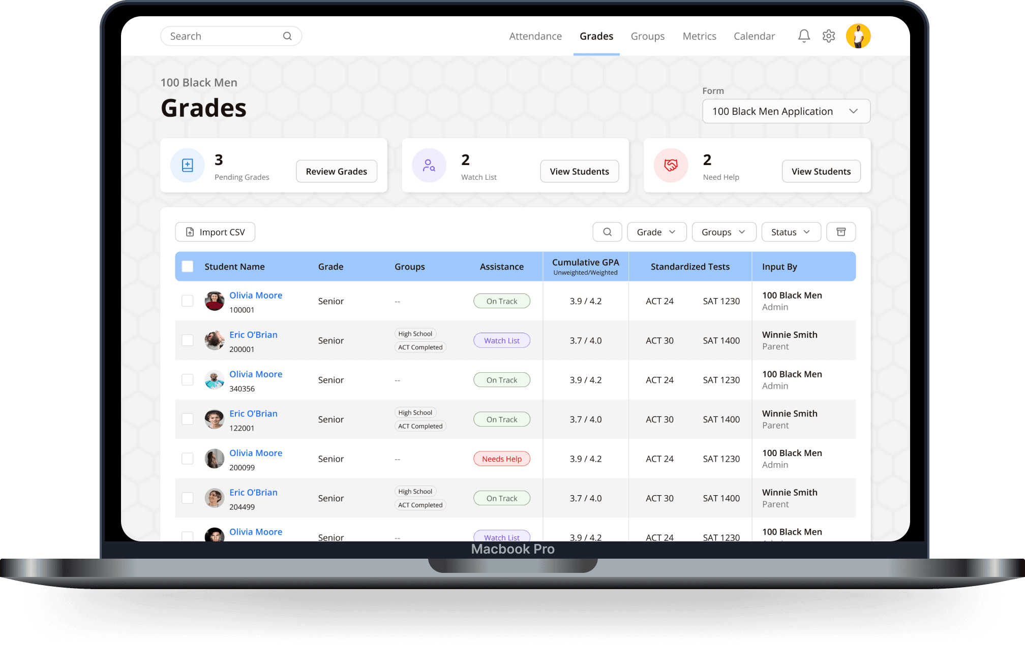
Figure 1.3 Client Grades Dashboard
Improving Work Flow and Focus
I conceived a way to help our users stay focused and organized on helping students which is our assistance system. Each students Cumulaitive GPA are taken into account to determine whether a student is on track or needs help.
Why It Works
One oof the most difficult tasks mentors have is tracking their students who are in need. this gives mentors an immediate snapshot of those students
Figure 1.4 Client Grades Input
Information Architecture
In the redesign, we focused on what mentors use most—classes, time frames, and class designations. We separated things like standardized tests, GPAs, and ranks to make everything clearer. This made the interface easier to read and navigate. We also organized it around classes


